Mobile-Friendly Websites Equal Higher Search Rankings
We’ve all been there. During a hectic day at work or running errands, you realize you haven’t eaten since breakfast. With little time to waste, you pull into the nearest parking lot and use your mobile device to search for “local lunch pickup.” When you click on the first result, the website doesn’t display properly. You can’t read the menu because Flash isn’t supported on your phone. Frustrated, you give up, return to Google and search again. This time, you recognize a national chain restaurant, Panera. Your experience accessing Panera’s menu is much better because the franchise has a mobile version of its website. In just a few moments, you have completed your order.
So why did Panera’s website beat out the local sandwich shop? In a word: “Mobilegeddon,” the alarmist nickname given to Google’s latest major revision to its core ranking rules, which dictated that mobile-friendly websites now earn a higher ranking than sites not deemed mobile-friendly.
Mobilegeddon has forced companies across all industries to scramble once again to satisfy the ever-changing tastes of Google’s page crawlers. Many find the search giant’s periodic shifting of the goalposts to be arbitrary and unfair. Having labored mightily to overcome the upheavals created by Panda and Penguin in recent years, website developers around the globe are now forced to revisit their website designs yet again. But rather than view it as a punishment, companies should leverage this development as an opportunity to make their websites more user-friendly.
An opportunity, not a catastrophe
The purpose of the new mobile-friendly rule is simple: to encourage companies to align their offerings more closely with mobile users’ demands for a smoother user experience. With searches on mobile devices now surpassing those on personal computers (one study found a 60-40 ratio in favor of mobile), the imperative for mobile-friendly website design is perfectly logical. It also presents opportunities for buyers and sellers alike.
Given the enormous amount of content in cyberspace, search engines must impose sifting mechanisms. Those mechanisms can only be effective if they adapt to changing usage patterns and continue to deliver value to site visitors and shoppers as technologies evolve. People searching the web want answers or solutions, not trillions of pages to sift.
Sellers also benefit from Google’s evolutionary approach, especially those willing to monitor and invest in the latest technologies (such as mobile). In any event, the rule is here to stay. Even an excellent website will not convert if no one can find it, or if it doesn’t display correctly on the devices used by 60 percent of today’s users. And it’s a safe bet that this share will continue to rise.
Google stated its intentions concerning the update a full two months ahead of the implementation date, and uncharacteristically, even provided a clear outline of how sites could comply. The company announced the availability of a “mobile-friendly test” to assess how sites measured up and spur companies to begin thinking about how to incorporate the move to mobile into their brand positioning strategies.
Within a few months, the impact of the update on rankings was apparent. BrightEdge tracked the results for more than 20,000 URLS, finding a 21% decrease in rankings for sites deemed not mobile-friendly by Google. And for those who feared the mobile update would wreak havoc on their desktop designs, another study found that desktop SEO visibility did not appear to suffer from the new mobile-friendly rule.
Mobilize your website
So how can a company improve the mobile-friendliness of its website? By fixing the sticking points that frustrate millions of people who search the web on mobile devices!
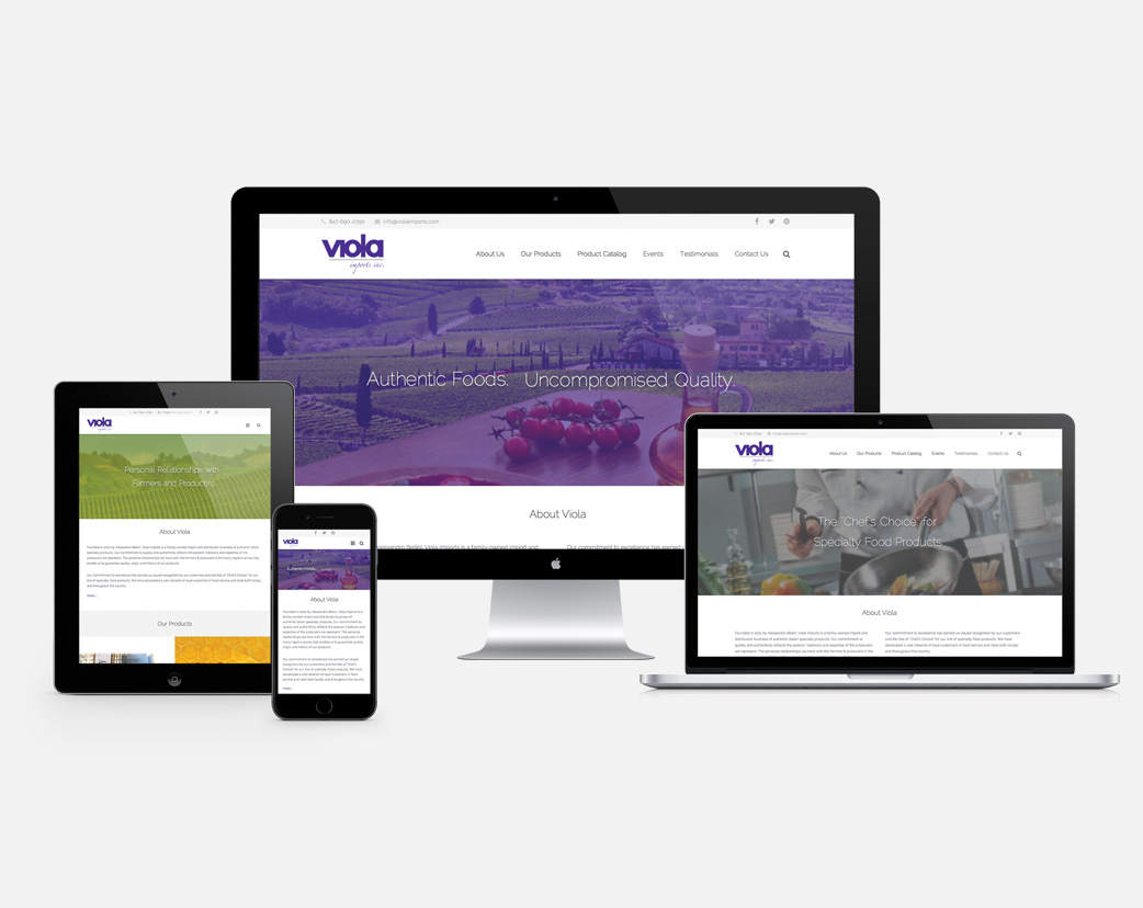
Clearly it’s going to be necessary to redesign for mobility right away, if it hasn’t already been done. Most companies choose to develop either a mobile (lightweight) website or a responsive design website. Both are more mobile-friendly than a site viewed on a desktop. Both are commonly thought to be two different ways to refer to the same thing. But they are not the same thing.
A so-called “mobile” site is a simplified, mini-version of a website. It’s a separate site, only viewable on mobile devices, and requires its own domain. That means the webmaster must create and manage two sites instead of one. Any activity on the mobile site – such as link sharing – does not factor into the search engine ranking of the main site.
Responsive design is a modification of an existing site, requiring some additional back-end code. Since it’s a single site with a single URL, there’s no diluting of search traffic. It automatically adjusts itself to the size, orientation and screen resolution of the user’s device – whether it be a desktop, tablet or mobile phone. And it’s actually recommended by Google, another reason why it’s worth looking into responsive design services.
In addition to taking the mobile-friendly test available from Google (Bing offers one too), the following steps will help you bring your site up to speed:
- Choose a design approach that your company can afford to manage
- Look closely at your Google Analytics data to learn how visitors are accessing and experiencing your site
- Simplify your site’s navigation by limiting menu bars
- Speed loading time by avoiding bulky visual files
- Improve readability by reducing content to its bare essentials
Google’s latest update pushes companies to better align their sites with the omni-channel habits of today’s consumers by designing websites that load quickly, read easily and navigate intuitively. It creates winners all around: millions of mobile users will enjoy a better online experience, which will almost certainly increase brand loyalty; and mobile-friendly sites will not only rank higher, they’ll also boost visibility and deepen brand recognition. That’s a great formula for winning more loyal customers, and gaining all the cross-selling opportunities that follow.
Learn how a mobile-friendly, responsive website design can bring out the best in your brand.